Delivered: Brand Identity + Print Assets
Albertman Properties, specializing in properties for middle-class buyers and renters, sought a sharp, bold, and professional logo.
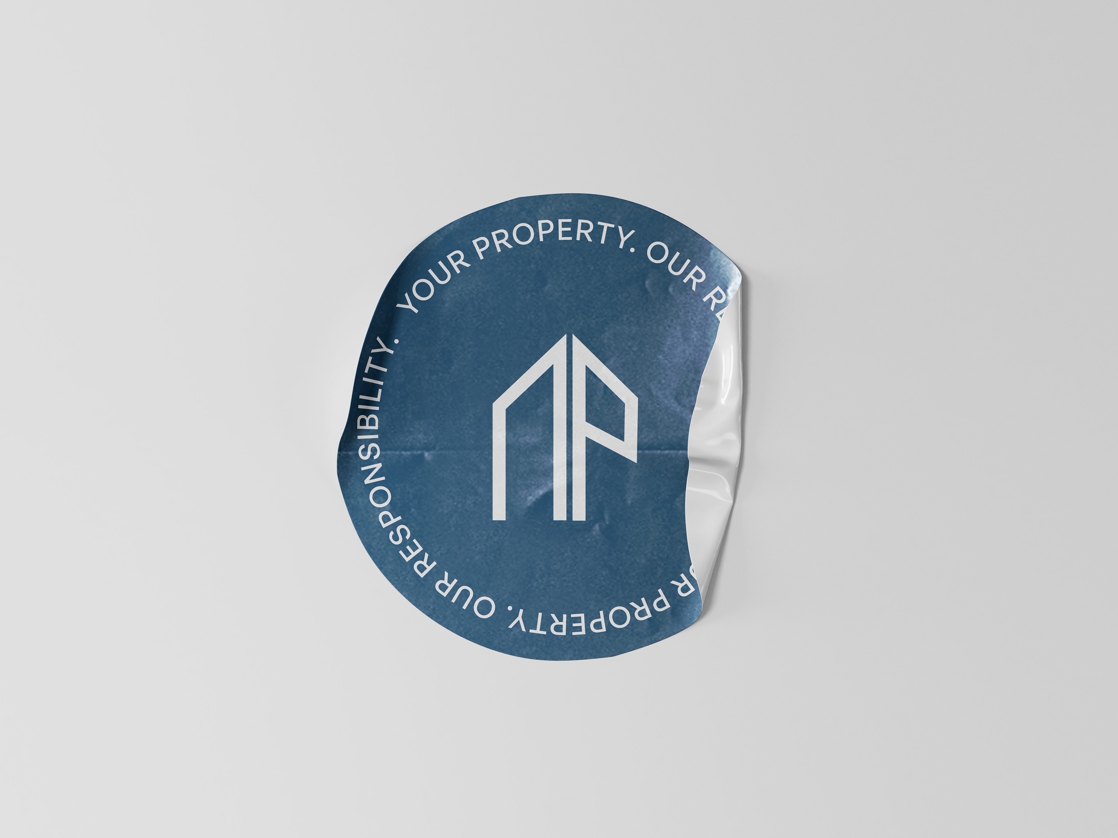
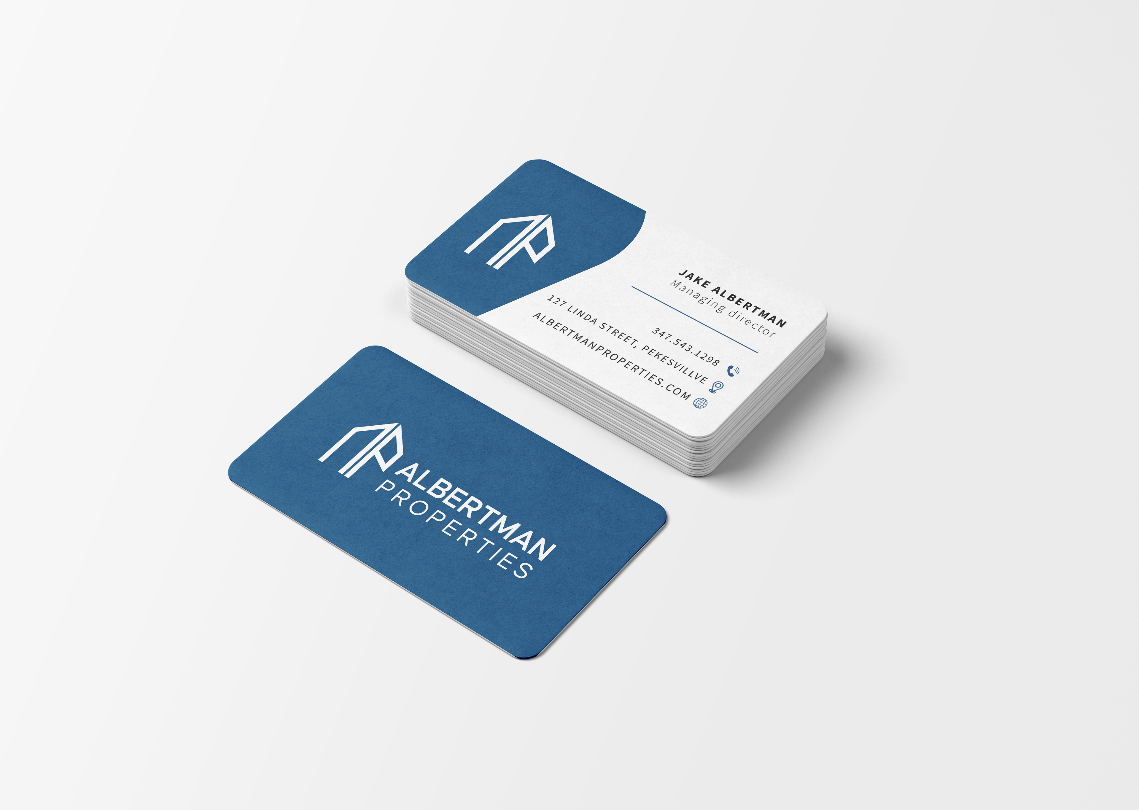
We analysed existing real estate logos to identify trends and develop a distinctive brand identity. The resulting logo features a stylized building icon incorporating the company initials, conveying strength and stability. The color blue, chosen for its associations with reliability and trust, further reinforces the brand's core values.
We also designed complementary business cards and letterhead that maintain the brand's professional and sophisticated aesthetic.